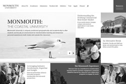
Students and faculty were greeted with a complete Monmouth.edu website revamp on the first day of classes, Sept. 8.
This is the second website change within three years that the University has experienced. The website has taken shape in a form quite similar to a Windows 8 type of “tile” structure.
The homepage is scattered with different articles and as one scrolls down the page, they would come into contact with a calendar of events. This calendar of events is much more prominent than the sidebar or scroll bar that the website previously had.
Social media also has its own tiles in the new website design including the social media handles as well as recent posts. Social media has a very large presence, especially in prospective students’ lives.
Sophomore english major, Ally Afanador said, “I think the new site is very nifty. It gives our university more character. It definitely suits us because we have been changing and renovating on even just the campus itself. I think that it is a great way to start off a new year at Monmouth.”
Another student, junior psychology major Marina Shafik said, “The new Monmouth website is great. The layout is very organized which makes it easy to navigate from one location to the next. The design of the page is simple to follow and it looks much nicer when it’s being viewed from a phone. The strongest aspects of the website would be the navigation tabs. The tabs divide up the website content and guide the user the website would be the navigation tabs. The tabs divide up the website content and guide the user to the place they need to be.”
Shafik also offered some criticism on the new design. “The only negative change would be how much is displayed on the homepage. The way everything is presented on the homepage makes it look more like a blog. However, I believe the new website is a better representation of the University.”
Tara Peters, Associate Vice President for University Marketing & Communications, who was the spearhead of the website’s revamping, explains that they wanted to give the site a fresh look in order to “direct us to promote our successes and to communicate clearly what distinguishes the university as an institution of higher education.”
Peters gave insight into what some of the new features and changes of the site including “Inside Monmouth,” a new functionality, and a much more graphical layout.
According to Peters the feature, “is a new section of the site that includes all new content that ‘demonstrates’ the uniqueness of the Monmouth brand. Within ‘Inside Monmouth,’ you’ll see 18 themes, each with a mid-length story narrative and approximately six other smaller callouts that showcase the breadth of each theme at Monmouth. Across the themes, the new content highlights students, faculty and staff from our Schools and Centers of Distinction.”
The new functionality of the website is explained by Peters in three facets:
“1) Multivariate testing functionality displays different versions of content to alternate visitors, allowing us to understand which imagery, copy and calls-to-action have the highest engagement. 2) Targeted content functionality used on the Admission page will provide a more personalized experience for visitors. 3) A new ‘request more information’ inquiry application has also been added to the Admission page, giving a quick and easy way for prospective students and their families to request information from us, whether through email, over the phone or in the mail.”
Lastly, the “request more information” inquiry form is an addition for the admissions page where prospective students can have their questions answered. While the Admissions page has a large variety of information, there is always the possibility of other questions to be had; therefore, this new request form is a great addition.
Peters described the inspiration for the new design, “Monmouth University is the region’s premier private coastal university. In approaching the visual design, we wanted to highlight the fact that our beautiful coastal campus sits at the heart of a vibrant culture rich in history, the arts, technology and entrepreneurship. The color palette and design elements definitely play into coastal location, while the tiled layout showcases more of what makes Monmouth unique up front.”
A sophomore marketing major, Brett O’Grady, believes the website gives the University a good brand.
“The new website page is sleeker, more modern and more up to date looking than before. It represents Monmouth in a great way and is much more eye appealing than the previous design,” O’Grady said.
While the overall response to the new site is fairly positive, Peters says that of course there will always be room for input and improvement, “Continuous improvement will be essential to evolve the website into a stronger marketing tool and a critical asset for achieving specific university goals.”
If you would like to give your feedback on the new website head to the new site and fill out a Website Feedback Form.


