The Athletics Department attempted to rebrand the University with the unveiling of the new logo in order to create a fresh identity that coincides with the athletic programs’ changes and renovations.
“I am very excited about our new athletic logos and spirit marks,” said University President Paul Brown.
“Athletics is an extension of a university’s identity, so this new change means a lot for the Athletics Department,” said Greg Viscomi, Assistant Athletics Director for Communications and New Media.
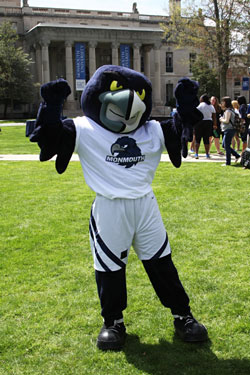
The primary mark of the new Athletics logo features a sideways hawk head with ‘Monmouth’ stamped across it. The letter mark is a singular ‘M’ and the word mark is ‘Monmouth’ outlined with the University’s colors.
“Our new hawk is also very dynamic; it really represents the University’s competitive spirit,” said Brown.
Since the Athletics Department’s reinvention with the various athletic changes around campus, such as the football stadium and new floor for the basketball court, the department felt a change in the logo necessary.
This logo, according to Viscomi, marks the beginning of a new era for the University.
The Athletics Department felt the old logo was outdated and did not represent the athletic teams as well as it once did.
“None of our coaches were wearing or purchasing the old gear,” said Viscomi.
“Both coaches and student athletes felt the hawk facing forward on the helmets was not fierce or intense enough,” Viscomi added.
The last drastic change involving the athletic logo was back in 2003. Over ten years ago, the original royal blue and white school colors changed to today’s midnight blue color.
In addition to the colors, Athletics moved away from the Hawk head logo and the singular ‘M,’ changing it to just ‘MU.’
Now in 2014, with months of discussion behind it, Athletics has decided to modernize themselves by going back to the pre-2003 look by dropping the ‘U’ in the logo.
“These new logos and marks are the third change to the Athletics Department’s brand identity since 2003,” said Eddy Occhipinti, Assistant Athletics Director for Marketing. “I know there were different logos for Athletics in the past, but our newest design is definitely here to stay.”
“I really like the new logo. It’s a fierce looking hawk,” said Zach Fabel, a junior football player.
“Having a new logo is really good for the [Athletics] program [because] it switches things up and it’s exciting,” continued Fabel.
Viscomi and the rest of the Athletics Department studied other university logos for inspiration. “We looked at over 300 Division I schools and paid attention to who incorporated the ‘U’ for university in their logos,” said Viscomi.
“Our logo needed a little more action and by looking at other schools, we knew we were way behind the mark of what is cool,” Viscomi added.
Aside from wanting to update their look, Athletics also wanted to create a name for the University, which is one of the main reasons why the ‘U’ was dropped from the logo. According to Vicsomi, because the University is named after a county, it could be confusing to people when they hear Monmouth if they are not familiar with the university. Therefore, the Athletics Department wants the University to be in conversation as an educational setting.
“A logo should give you pride in your institution and for the athletic teams, but also for the experiences you have at a great school like Monmouth,” said Occhipinti.
Talk of changing the department’s logo began in August 2013, with countless meetings and discussions. Viscomi said Athletics took their time and did not make any rash decisions, as the whole process of the logo change took about eight months.
“There was a committee of 10 people working on this change from all levels of Athletics,” said Viscomi. Viscomi said that later on in the redesign process, student-athletes and other members of the community became involved in the final decision making.
The new logo was ultimately revealed to the University community on Shadow Lawn this past May in celebration of Monmouth’s Pride Day.
During the long process of deciding on a new logo, not everyone in the Athletic Department was on board for the new look.
“People are resistant to change, and I was one of those people,” said Viscomi. Aside from Viscomi being hesitant on the modernized look, Viscomi said that coaches were most resistant to the change, but any counter arguments they had fell through.
Additionally, Athletic alumni were also timid at first. “When we reached out to alums about how they felt of the changed logo, their feeling was that this new identity is not what they graduated with,” said Viscomi. “It was different and it took them time to get used to.”
However, with all of the other positive changes in Athletics, Viscomi said the alumni decided that they were ready for this new era and stamp in Athletics.
In addition to all of the positive feedback of the new athletic logo, there are some that do not particularly care for the new hawk.
“From a design and branding perspective, I am not impressed with the single ‘M,'” said Andrew Cohen, Chair and professor of the art and design Department. Cohen feels the ‘M’ looks too generic, and lacks any character or excitement.
Aside from professors, some non student-athletes are also not excited over the new hawk. “I’m not crazy about the sideways hawk and the singular ‘M,'” said Christian Caruso, a junior business major. “It’s not terrible, but the new logo does not really entice me to buy a new sweatshirt or t-shirt.”
With a rebranding of Athletics, new athletic apparel was added to the bookstore.
“Our sales have been really good, we worked with an online manufacturer that flipped the whole online store over,” said Viscomi.
During the different times of the year, there will be both increases and decreases in the purchase of athletic apparel on campus. “The bookstore always sees an increase in the sales of the clothing in the beginning of the semester, then it dips for some time and springs back up come the holidays,” said Viscomi.
“The new bird and ‘M’ look a lot better on apparel, such as t-shirts and sweatpants,” said Justin Robinson, a junior basketball player.
“We in Athletics, and myself as an alum and employee, couldn’t be happier with the new look,” said Occhipinti.
PHOTO COURTESY of Monmouth University


